

The Challenge
The Smart Museum was nearing its 40th anniversary and it was time for a website refresh. A major goal was to draw in more diverse audiences and provide a window into the multitude of activities and programs happening at the Smart.
Discovery
I interviewed 5 stakeholders from the museum, including the Collection Curator, the Executive Director, the Director of Education and Interpretation, the Associate Director of Communications, and a Guest Services Representative. They named the following opportunities for improvement:
Website design is too restrained and quiet - does not capture the excitement and intellectual activity of the museum
Widespread public perception that museum is private and only open to the University community
Museum is attracting traditional audiences, but not younger audiences, audiences from the Northside, or audiences from the surrounding community
People often call and ask questions about basic information, like when the museum is open, and whether there is an admission fee
Calendar of events is text-heavy and not engaging
In addition, I conducted a competitive analysis of peer sites.
Definition
I used my findings from the stakeholder interviews and competitive analysis to draft a revised site architecture and create wireframes for the new site.
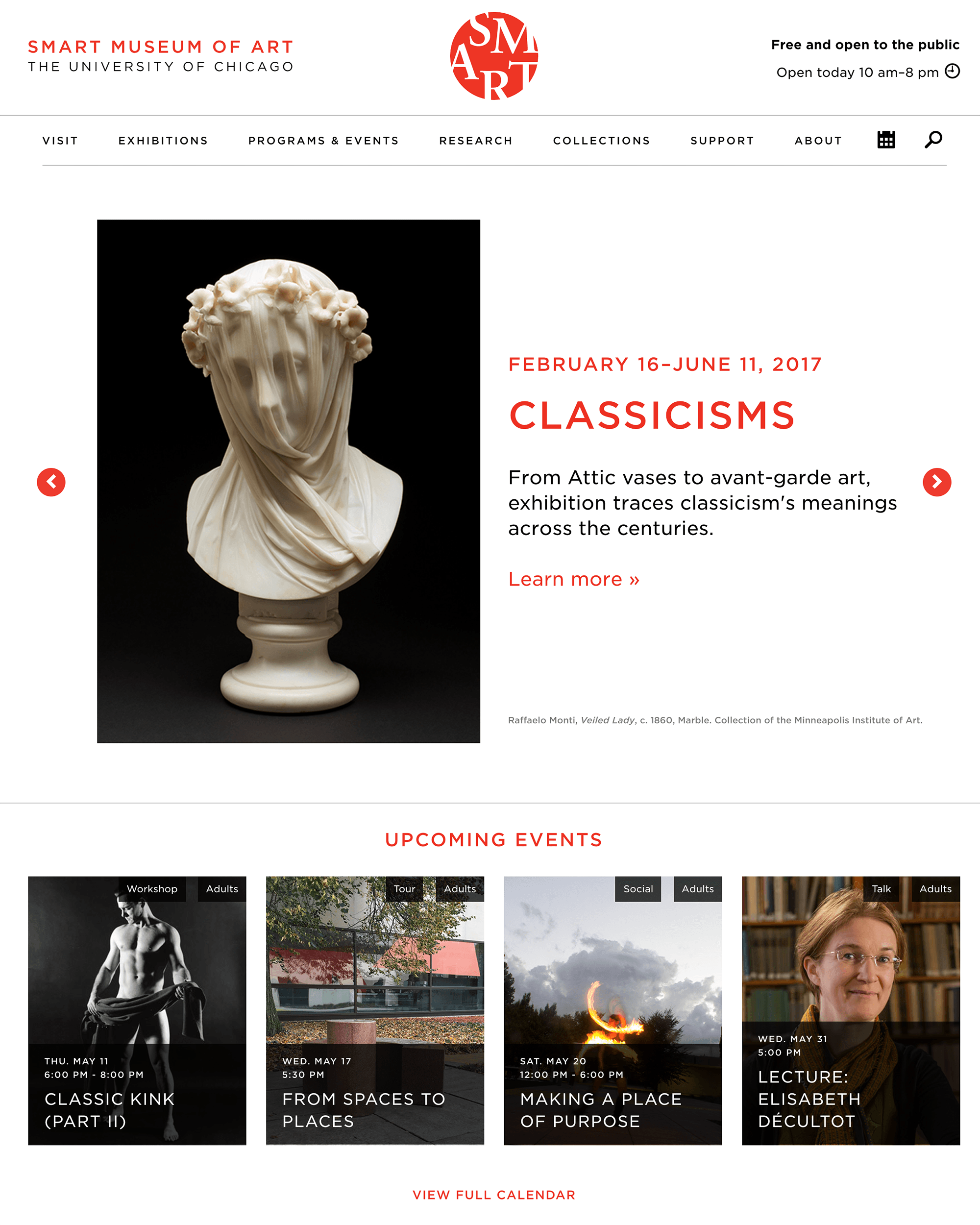
Homepage
Overview
Duration
8 months
Role
UX Designer
Methodologies
Stakeholder Interviews, Competitive Analysis, Prototyping
View Smart Museum website
I rearranged the layout and content of the homepage to convey a sense of openness and activity at the museum. Here are the changes I made (top to bottom):
The museum's hours are now prominently featured at the top of the page and include the message "free and open to the public". This reduces potential visitor questions about whether the museum is open to the public, or open at all.
Events are featured in blocks with photos, and are categorized by type of event and target audience. This reinforces the openness of the museum to all types of audiences and shows the great diversity of programs that take place at the Museum.
Blocks featuring the docent program, study room, and programs for teachers show additional ways Smart engages with the surrounding community, university community and educators.
Calendar

I redesigned Smart's calendar to be more visual and provide pertinent information at a glance. This is how I accomplished that:
I added a space for images for each event
I added two sets of tags for each event: one for the type of event, and one for the event's intended audience(s). This reinforces the idea that the museum engages a wide variety of audiences in a intriguing assortment of activities. These tags also help change public perception that Smart is a closed, self-contained place, and show that there is "something for everyone" at the Smart.
Visual Design
One of our front-end designers, Dora Fraeman, brought the blueprints to life with an airy, spacious, whitespace heavy design that echoes the interior of the Smart Museum.

Impact
Smart Museum was very pleased with the new website they had to show off for the year of their 40th anniversary. Since the launch of Smart's redesigned website, many clients have requested a website design like Smart's or an events calendar like Smart's. The Smart Museum website design has withstood the test of time and is live after 5 years.